
Peachy Keen: How to Infuse These Youthful Hues For You
One color pairing has emerged to steal the spotlight in a world where trends come and go like fleeting whispers on the wind. Pantone's color of the year, Peach Fuzz, and jewelry's color of the year, Apricot Crush, have seamlessly intertwined to create a harmonious blend of peachy perfection that captures designers' imaginations and sparks joy in our lives like never before.
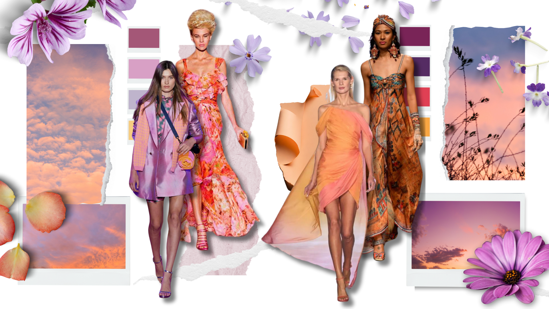
The soft and delicate hues of peach and apricot not only summon our admiration but also provide a portal to connect our collective desire for optimism and renewal.
It’s an exciting time for fashion enthusiasts with the announcements of this year’s featured colors when we’re all desiring a little levity. In this post, I’ll walk you through how you can leverage the season’s velvety hues to wear confidently. You’ll learn -
Introduction to Pantone’s Color of the Year Peach Fuzz
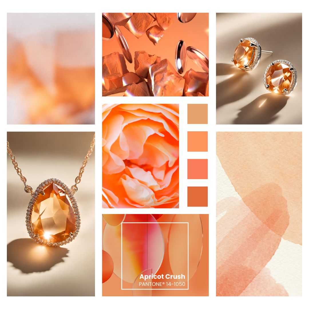
Color Trend in Jewelry Apricot Crush
The Peach Color Trends’ Influence on Pastel Jewelry
Pastel Gemstones
Best Pastel Colors for Your Skin Tone
Pastel Jewelry Style Tips and Outfit Suggestions
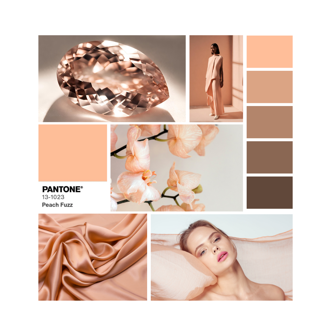
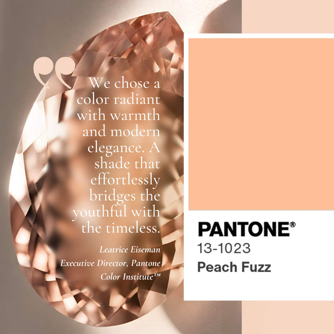
Introducing Pantone’s Color of the Year Peach Fuzz
As we step into 2024, Pantone has declared Peach Fuzz as the color of the year, signaling a shift toward embracing soft and comforting hues. This delicate pastel shade exudes warmth and tranquility, offering a gentle reprieve from the chaos of the modern world. With its subtle yet striking presence, Peach Fuzz is set to make waves in fashion and design realms, igniting a renewed appreciation for femininity and sensitivity.
Peach Fuzz's significance is setting a tone that intentionally considers cultural temperature as either a reflection or an antidote. This point was made relevant by Laurie Pressman, vice president of the Pantone Color Insitute, when she explained that the 25th annual color choice was influenced by the “unusual time we continue to find ourselves living in.” She also said, “It is a color that is heartfelt and one that people can draw comfort from.”
Color’s undeniable ability to evoke feelings is a valuable resource of inspiration to draw from, especially in fields of design. Expect to see an emergence of peach-toned colors in this year’s runway collections as an invitation to embrace the same meanings behind the velvety, gentle tone of Peach Fuzz.
The transformative powers of what we wear also have a timeless relevance to jewelry. Designers looking to evoke the same “kindness and tenderness,” Laurie Pressman stated in Pantone’s press release, employ similar delicate shades of gemstones in new designs for those seeking solace amidst the hustle and bustle of daily life.
These are the same reasons why a brilliant sunset can quiet a busy mind after a long day. It won’t solve our problems, but it has the potential to infuse our world with a sense of calmness and tender beauty, welcoming us to celebrate the serenity found in a moment of stillness.
Color Trend in Jewelry Apricot Crush
Apricot Crush is a color that brings a fresh and vibrant energy to the world of jewelry. It represents a perfect blend of peachy hues of Pantone’s Color of the Year and pastel undertones, adding a touch of elegance and sophistication to any ensemble. This emerging trend in jewelry design has been widely embraced by fashion enthusiasts, who love how this delicate shade of gemstones can effortlessly elevate their style.

The use of apricot-colored gemstones in jewelry designs creates an exquisite look with its soft and feminine appeal. The gentle shades bring out the natural beauty of gemstones like morganite, Australian opal, aquamarine, Kunzite, and pearl, making them an ideal choice for those seeking to update their look effortlessly.
Designs featuring these delicate gems reflect current fashion trends. Plus, they pair gorgeously with vibrant shades of crimson and calming lavender to spark new joy into your wardrobe.
In addition to being trendy in the fashion world, apricot crush jewelry also holds cultural significance. In many cultures around the globe, peach is considered the symbol of longevity, immortality, and good luck.
So if you are looking for something that adds both elegance and cultural depth to your ensemble this year, embracing apricot crush jewelry can inject positivity into everyday living, changing our mood one day at a time.
The Peach Color Trends’ Influence on Pastel Jewelry
Pastel jewelry trends for 2024 incorporate both featured colors, reflecting a blend of elegance and modernity. Here are some key trends independent designers are using to interpret the fuzzy feelings of this season’s hottest color palette.
Soft Gemstones: Pastel-colored gemstones like morganite, aquamarine, and opal are gaining popularity in jewelry designs. These stones offer a subtle yet eye-catching touch to any piece.
Pearls with a Twist: Traditional pearls are being reimagined with pastel hues and innovative designs. Expect to see pastel-colored pearls in unconventional shapes and settings, adding a contemporary flair to classic elegance.
Cluster and Halo Designs: Cluster and halo designs featuring morganite surrounded by smaller diamonds or gemstones have gained popularity for their elegance and sparkle.
Mixed Metals: Pastel jewelry is often paired with mixed metals like rose gold, silver, and pale gold to create a harmonious contrast. This combination adds depth and dimension to the pieces.
Statement Designs: Pastel jewelry is embracing bold cocktail rings and oversized pendants. This trend reflects an appreciation for the gem's natural beauty and celebrates individuality through unique and eye-catching designs.
Nature-Inspired Motifs: Floral patterns, leaf motifs, and other nature-inspired elements are prevalent in pastel jewelry designs, evoking a sense of femininity and connection to the natural world.
Personalized Pieces: Customized pastel jewelry, such as birthstone rings or initial pendants, continues to be a popular choice. These pieces allow wearers to add a personal touch to their accessories.
Keep an eye out for these trends in 2024 to stay fashionable and on-trend with your pastel jewelry choices!
Pretty Pastel Gemstones
When it comes to harmonizing and complementing the soft hues of pastel jewelry, let's look first at the peach-hued gemstone Morganite. The soft palette of Morganite echoes the peach undertones of popular pastels, making it the perfect companion to this season’s hottest fashion.

💎 A dreamy palette of spring pastels play well together
To identify the prettiest coordinating shades, all one has to do is reference basic color theory. By combining complementary colors on the color wheel, jewelry designers can create many aesthetically pleasing combinations of gemstones in their designs.
With this in mind, one cannot overlook the exquisite pairing with aquamarine. The soothing blue tones of aquamarine effortlessly balance with other pastel-colored gemstones, creating a serene and ethereal combination.
The gentle contrast between gemstones adds depth and dimension to any jewelry piece, making it an ideal choice for those seeking a subtle yet striking aesthetic.

The double-split complimentary shades of serene blues of Aquamarine, coupled with hints of yellow and pink undertones, create a captivating contrast against the delicate hues of peach and pastels. By selecting colors adjacent to the complement of the base color, Aquamarine creates a balanced and visually appealing palette that incorporates both contrast and harmony.
Adding lavender sapphire accents is another gorgeous option to complement a pastel jewelry palette. When combined with other dreamy color schemes, the pale purple shades of sapphires add a sense of luxury and elegance. Furthermore, incorporating touches of gold can add warmth to this pairing, giving it a harmonious and timeless appeal.
For those seeking a fresh and modern update to the classic pearl necklace, look for luminous pearl accents for an elegant and feminine touch. Pearls’ shiny luster effortlessly blends with the soft pastel tones, increasing the ethereal allure of pastel jewelry while infusing a contemporary twist to jewelry designs.
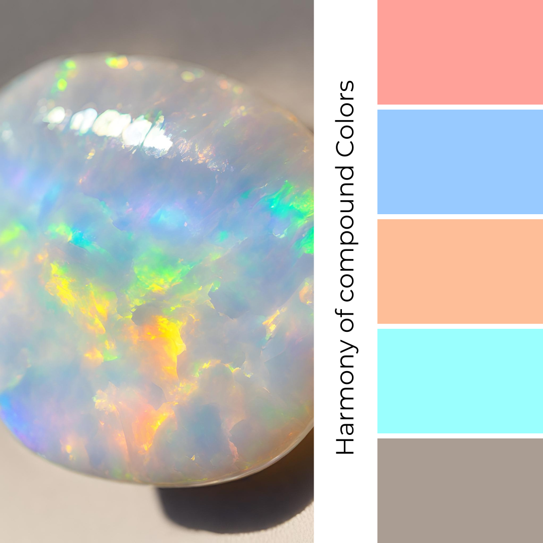
Similarly, Australian opal, with its iridescent play-of-color, provides a whimsical and ethereal touch to pastel jewelry designs. The fiery flash of Australian opal gemstones adds vibrant depth and dimension to pastel fashion by mixing primary colors on the color wheel. The blues and aquas in opals provide a cool contrast to the soft pastel tones, while the shades of salmon add warmth to offer a rich and diverse palette.

Lastly, for an elegant and feminine touch, Kunzite presents itself as a captivating gemstone option. As adjacent colors on the color wheel, Kunzite and pastel tones share similar undertones, creating a sense of unity and tranquility when used together. The gentle pink of Kunzite offers a harmonious complement to pastel fashion.
Best Pastel Colors for Your Skin Tone
When it comes to choosing the best pastel colors for warm-toned skin, it's essential to opt for shades that complement your undertones and enhance your complexion. Warm-toned skin typically has undertones of yellow, peach, or golden hues.
Here are some pastel color recommendations for individuals with warm-toned skin:
Peachy Pastels: Shades like coral, salmon, and peach can bring out the warmth in your skin and create a beautiful contrast.
Warm Pink: Soft, warm pinks with hints of coral or apricot can flatter warm-toned skin.
Apricot: This pastel shade with a touch of orange can complement warm undertones and add a lively pop of color.
Soft Gold: Pastel gold or champagne hues can enhance your skin's natural warmth and provide an elegant look.
Mint Green: A subtle mint green can work well with warm undertones, creating a refreshing and harmonious appearance.
Lavender: Soft lavender shades with warm undertones can be a unique choice for a pastel look.
Warm Beige: A pale, warm beige can be a neutral pastel option that complements your skin tone.

Remember that makeup and clothing colors can vary in their undertones, so it's essential to test them to see how they look against your skin before making a decision. Also, personal preferences and individual variations in skin tone may affect which pastel shades suit you best, so experimenting with different colors is always a good idea to find your perfect match.
When it comes to choosing the best pastel colors for cool-toned skin, it's important to select shades that complement your undertones. Cool-toned skin typically has pink, blue, or purple undertones. Here are some pastel colors that tend to work well for individuals with cool-toned skin:
Cool Lavender: A soft, cool-toned lavender can enhance your complexion and bring out the natural cool undertones in your skin.
Baby Blue: Light shades of blue, such as baby blue or periwinkle, can look flattering on cool-toned skin.
Mint Green: Pastel mint green can be a great choice for cool undertones, as it contrasts beautifully with the pinkish hues in the skin.
Soft Pink: While cool-toned individuals can wear many pastel colors, a soft, cool-toned pink can provide a delicate and harmonious look.
Lilac: Lilac is another lovely option, as it combines the coolness of purple with a touch of pink.
Ice Blue: This pale, icy blue can make your skin appear radiant and complement your cool undertones.
Dusty Rose: A muted, dusty rose or mauve can create a soft and sophisticated look on cool-toned skin.

Pastel Jewelry Style Tips and Outfit Suggestions
When it comes to styling pastel jewelry, versatility is the name of the game. For a daytime look, consider pairing a delicate pastel piece with a flowy maxi dress and sandals for an effortlessly elegant ensemble. The soft pink hues of the stone complement earthy tones beautifully, making it perfect for outdoor brunches or casual weekend outings.
Transitioning into evening wear, a statement piece can add a touch of sophistication to your outfit. Opt for a sleek black jumpsuit or an elegant cocktail dress to create a dramatic backdrop for your lighter-hued jewels. Remember that less is more when it comes to accessorizing with statement pieces – let the jewelry take center stage by keeping your outfit simple and chic.
The most apparent styling of pastel jewelry is with the feminine colors associated with weddings. Pastel jewelry has become an increasingly popular choice for brides during wedding season.
These soft, delicate hues can add a touch of elegance and whimsy to any bridal look. Gone are the days when traditional gold or diamond jewelry were the only options for brides—the current trend is all about exploring unique and unconventional choices that reflect one's personality.
So whether you're dressing up for a special occasion or simply adding some flair to your everyday wardrobe, pastel jewelry offers endless possibilities for creating stunning looks that reflect your unique style and personality.
The Do’s and Dont’s of Wearing Pastels
Wearing pastel colors can be a great way to add softness and a refreshing touch to your outfit. Here are some do's and don'ts to keep in mind:
Do's:

Pair pastel colors with neutrals: Pastels work well with neutral colors like white, beige, gray, and navy blue. This creates a balanced and harmonious look.
Experiment with different pastel shades: Pastel colors come in various hues like soft pink, baby blue, mint green, lavender, and pale yellow. Don't be afraid to mix and match different pastel shades for a unique ensemble.
Incorporate pastels in your accessories: If you're unsure about wearing pastels head-to-toe, start by incorporating them into your accessories such as scarves, handbags, shoes, or jewelry.
Layer pastel pieces: Layering pastel garments can add depth and interest to your outfit. Try layering a pastel cardigan over a neutral top or wearing a pastel blouse under a blazer.
Keep the rest of your outfit simple: Since pastel colors are soft and delicate, avoid overwhelming your look with too many bold patterns or bright colors. Opt for simple and clean silhouettes to let the pastels stand out.
Consider Your Skin Tone: Choose pastel shades that complement your skin tone. For example, warmer pastels like peach or coral can look great on those with warm undertones, while cooler pastels like mint or lavender can complement cooler undertones.
Don'ts:
Avoid wearing too many pastel colors at once: While mixing pastel shades can be fun, wearing too many pastels in one outfit can look overwhelming and clash. Stick to one or two pastel colors as the main focus of your look.
Don't forget about contrast: Make sure there is enough contrast between your pastel garments and your skin tone. If a pastel color washes you out, try wearing it away from your face or layering it with a darker shade.
Steer clear of overly sheer fabrics: Some pastel-colored fabrics can be quite sheer, which may require additional layering or undergarments to maintain modesty. Be mindful of the opacity of the fabric when choosing pastel pieces.
Avoid pairing pastels with overly bright or neon colors: Pastels are soft and muted, so pairing them with bright or neon colors can create a jarring effect. Stick to more subdued hues for a cohesive look.
Don't forget about the occasion: While pastel colors are versatile, they may not always be appropriate for every occasion. Consider the dress code and atmosphere of the event when incorporating pastels into your outfit.
Neglect Seasonality: While pastels are often associated with spring and summer, they can be worn year-round. However, be mindful of seasonal fabrics and layering techniques to adapt pastels to different weather conditions.
By following these do's and don'ts, you can confidently incorporate pastel colors into your wardrobe and create stylish and elegant looks.
Conclusion
The fresh appeal of trends will always be a beautiful distraction, but like the tides, they always leave something lasting behind. As we navigate through an ever-changing landscape of style and aesthetics, pastel jewelry has proven itself to be more than just a passing trend; it has become a timeless staple in every fashionista's repertoire.
If you’re feeling indulgent, remember that it is our nature to be drawn to the very things that provide little else besides the splendor of beauty they offer the viewer. There may be a more profound cultural significance for appreciating beauty without an agenda.
It is so significant, in fact, that it could be the key to our humanity. Why else do we seek to surround ourselves with beauty?
So go ahead and be indulgent. Soak up the beauty in the world. Guilt-free.

Get instant inspiration with my guide on how the season’s hottest color trend is elevating the classic jewelry style of pastel jewelry and how to make it uniquely work for you. Shop pastel gemstone jewelry.