One of a kind · Hand set in Denver
Jewel Tone Gemstone Jewelry
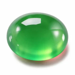
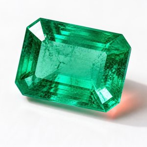
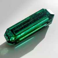
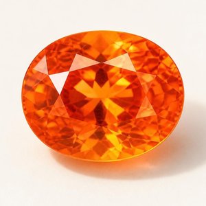
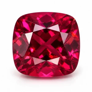
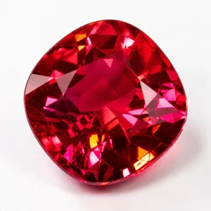
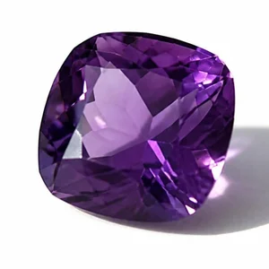
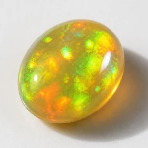
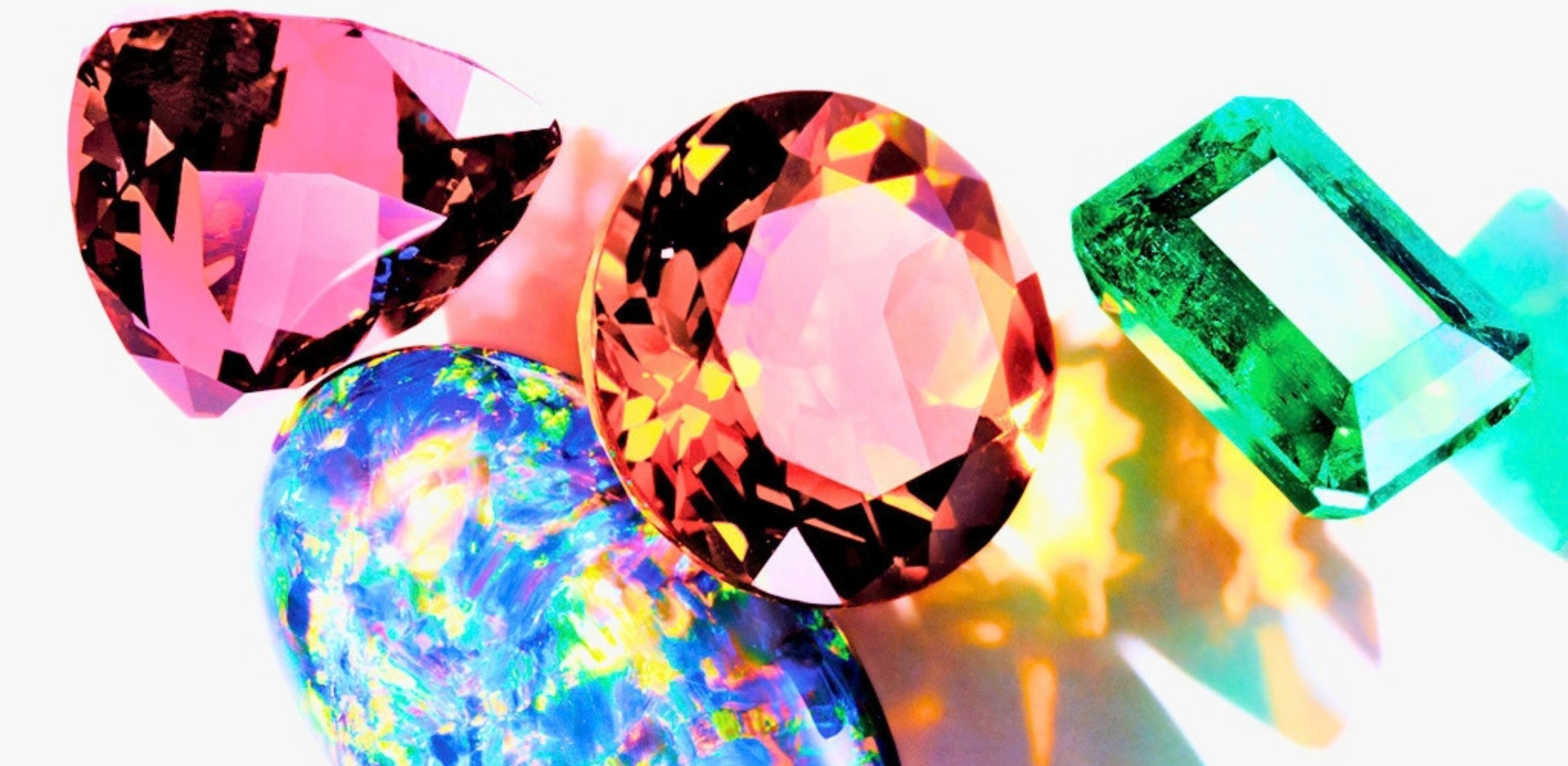
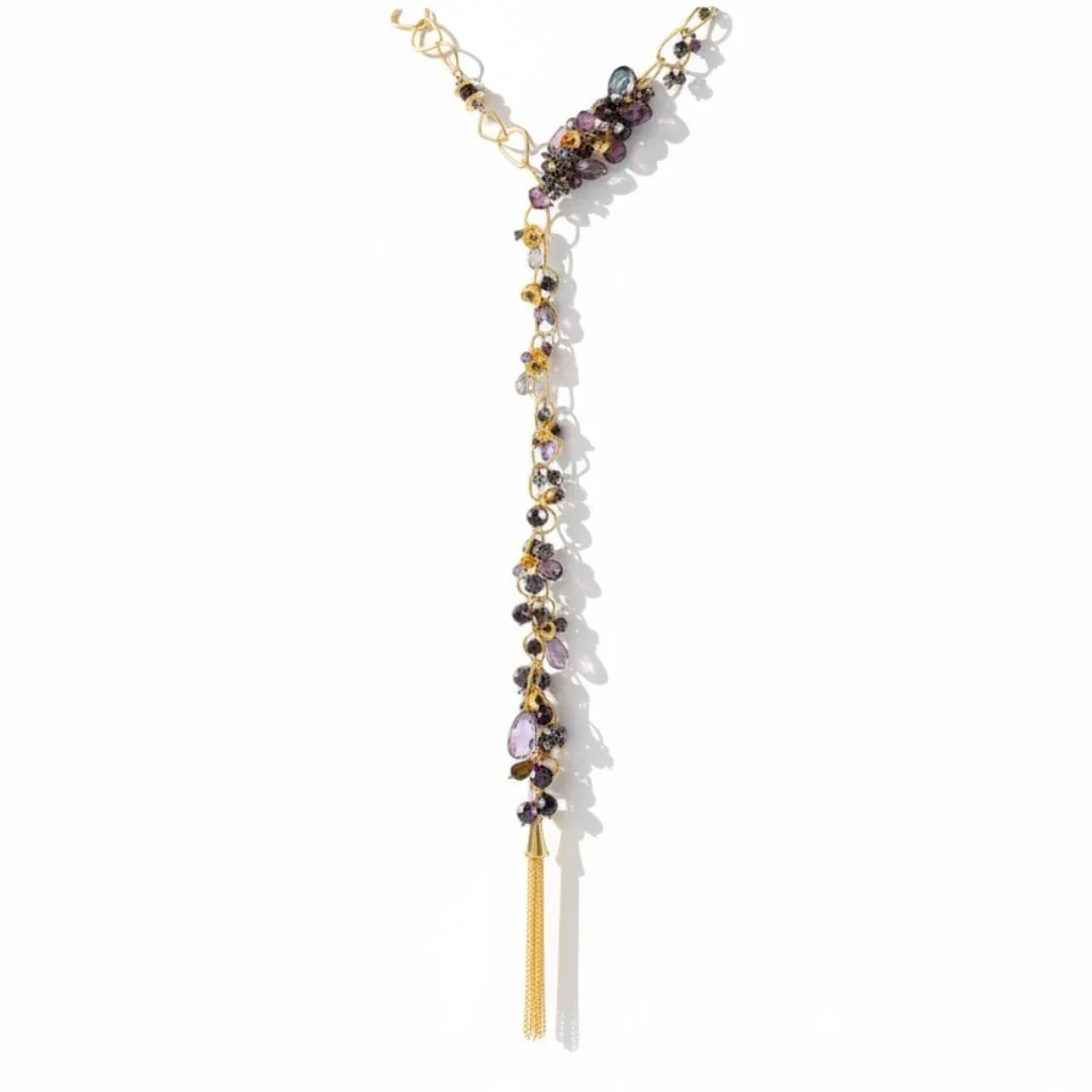
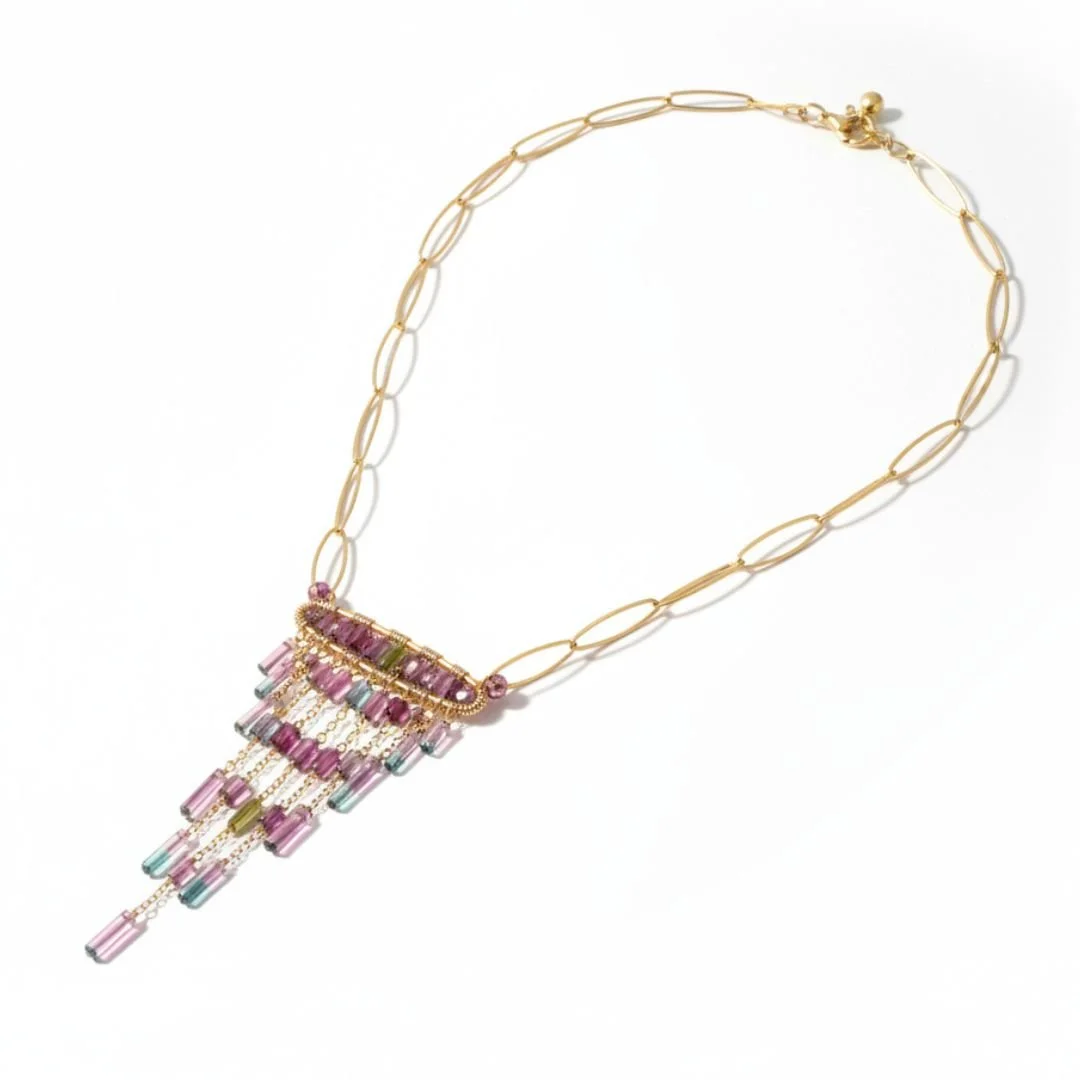
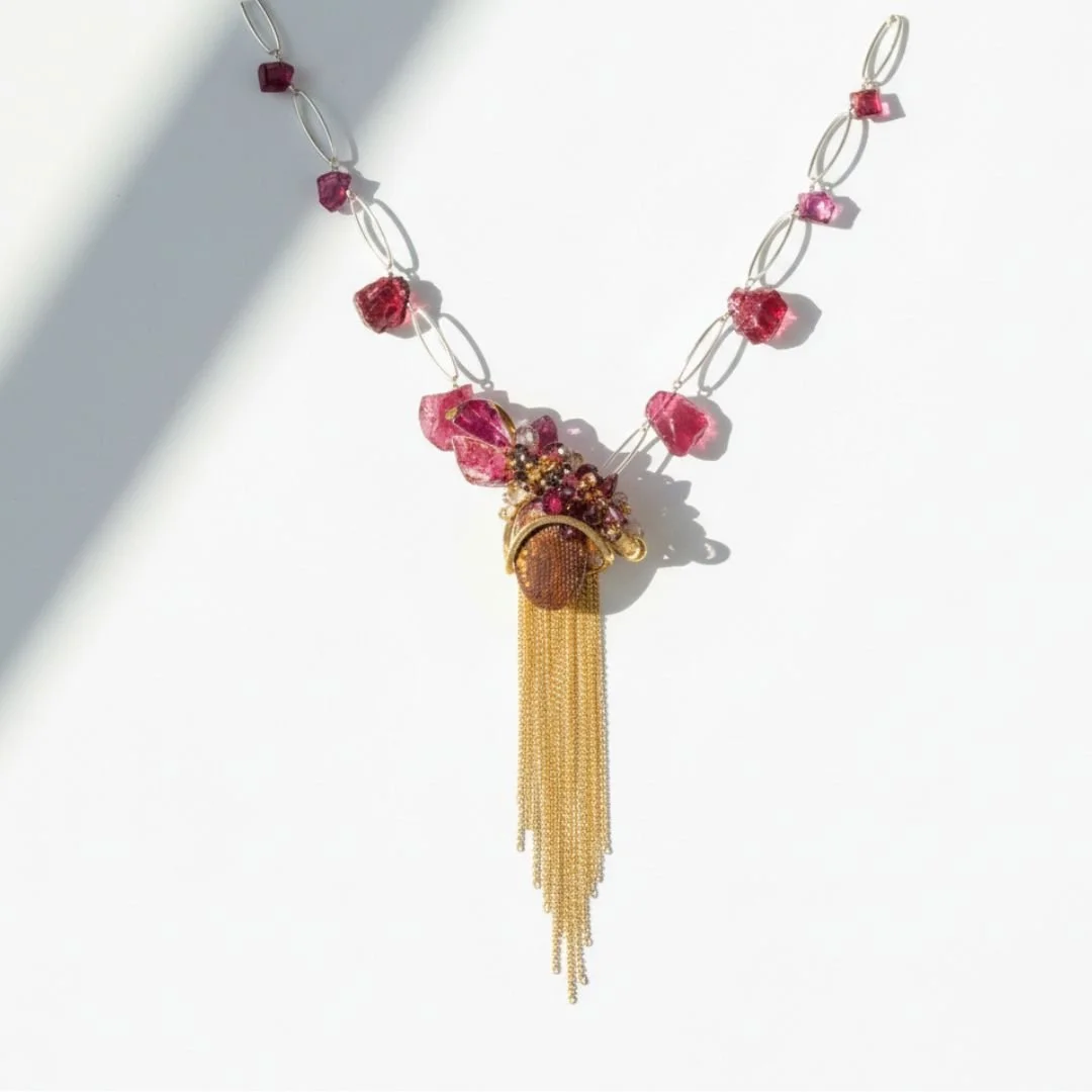
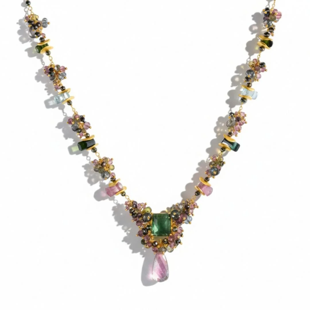
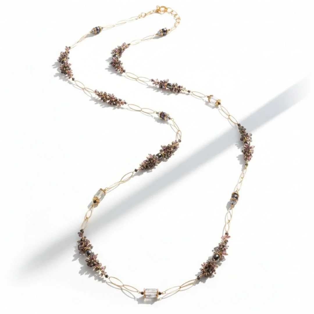
Jewel tone means color at full saturation. Deep, dense, glowing, and nothing like the soft end of the spectrum. These are one-of-a-kind pieces built around saturated center stones, chrysoprase and Colombian emerald, chrome tourmaline, spessartite and rhodolite garnet, spinel and deep amethyst, each one hand-set in my Denver studio. I buy every stone for its color and its cut before it is ever part of a design, which is why no two pieces are the same.
Andrea Li
What is the difference between jewel tone and pastel jewelry?
Both terms describe where a color sits, not which stone it is. Pastel gemstones are light in tone and low in saturation, so a lot of white light passes through them, which is what makes them read soft, airy and serene. Jewel tone gemstones sit at medium to dark tone with high saturation, which gives them the dense, glowing richness people associate with royal jewels. The same mineral can land in either camp. Amethyst is the clearest case: pale lilac amethyst is a pastel, deep royal purple amethyst is a jewel tone, and they are the same stone at two points on the dial. I work at both ends, so I buy them as two separate palettes.
Pastel
The very light end of the spectrum. High amounts of white light pass through.
Low, for a muted and soft effect.
Light, airy, delicate, romantic. Soft ethereal clarity, muted blush tones, cloud-like blues, shimmering opalescence, pearl luminescence.
Blush kunzite, Australian opal, pale amethyst, lavender keshi pearl, morganite, aquamarine, moonstone.
Jewel tone
Medium to dark, which creates a dense, rich look.
High, for a vivid and glowing impact.
Luxurious, dramatic, opulent, regal. The colors associated with royalty, deep purples and reds, bold in character.
Chrysoprase, chrome tourmaline, Colombian emerald, spessartite and rhodolite garnet, spinel, deep amethyst.
From the bench · Andrea Li
Neither one is the soft option. Both are statements. They are built for different moods, because jewelry is how you show the world how you want to be seen, and the piece has to represent that accurately.
Drawn to the other end of the range? See the pastel gemstone collection.
Which Jewel Tone Stone Flatters You?
Jewel tones are high saturation, so they hold their own against every complexion. The question is not whether you can wear them. It is which undertone you want to play against.
Fair & Light
Cool jewel tones give you contrast without heaviness. Rhodolite garnet reads raspberry rather than brick against fair skin, Colombian emerald stays crisp, and deep amethyst is the classic. Go carefully with mandarin spessartite, which can pull warmth you may not want.
Medium & Olive
The greens are yours. Chrysoprase and chrome tourmaline harmonize with olive undertones instead of fighting them, and emerald looks made for this range. Spessartite garnet adds a warm counterpoint when you want one.
Warm & Golden
Spessartite garnet, citrine and fire agate are the natural match, glowing rather than competing. Chrome tourmaline in gold creates the warm and cool tension that photographs best, and spinel reads hot pink rather than red.
Deep & Rich
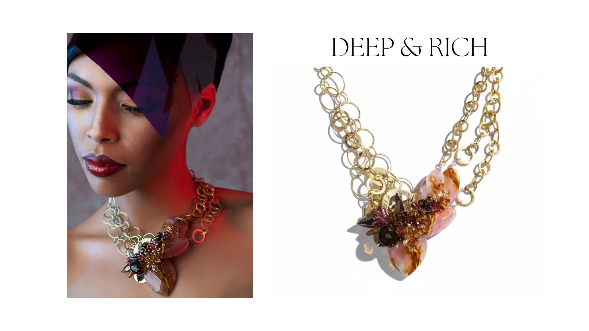
This is where jewel tones are at their most powerful. Chrysoprase goes electric. Emerald and deep amethyst gain depth instead of disappearing. Black opal against deep skin is one of the most striking combinations in jewelry.
When to Give Jewel Tone Jewelry
Jewel tones own more of the birthstone calendar than any other palette, and they suit the occasions where you want the gift to be remembered rather than simply appropriate.
Birthstone Months
Jewel tones cover the calendar unusually well: garnet (January), amethyst (February), emerald (May), opal and tourmaline (October), citrine (November). Five months, five stones I work with by hand.
The Milestone
Emerald marks a twentieth and a thirty-fifth anniversary. A promotion, a birthday with a zero in it, a thing that took years. Saturated color suits an occasion you want to be able to point at later.
The Person Who Wears Black
If her wardrobe is black, charcoal and navy, jewel tones are the only jewelry that registers. One saturated stone against black becomes the entire color story of the outfit, which is exactly how these pieces are designed to be worn.
The Bride Who Is Not Doing Pale
Not every bride wants soft. A deep amethyst or an emerald reads as a deliberate choice rather than a default, and it photographs with real depth. Explore wedding jewelry
Holiday and Evening
Jewel tones are the palette of the season for a reason. Garnet, citrine and deep amethyst carry candlelight and low winter light better than anything soft, which is why they read as party jewelry without trying.
Find Your Jewel Tone
Four stones, four personalities. Each one is a jewel tone, but how they wear, what they cost and who they suit are not the same.
| Property | Chrysoprase | Colombian emerald | Rhodolite garnet | Deep amethyst |
|---|---|---|---|---|
| Color | Apple green | Deep blue-green | Raspberry purple-red | Royal purple |
| Mineral | Chalcedony | Beryl | Garnet | Quartz |
| Hardness | 6.5 to 7 Mohs | 7.5 to 8 Mohs | 7 to 7.5 Mohs | 7 Mohs |
| Daily wear? | Good | Good (avoid hard impact) | Excellent | Excellent |
| Cut as | Cabochon, opaque to translucent | Faceted, with visible jardin | Faceted, clear | Faceted, clear |
| Personality | Vivid and alive | Regal | Warm and deep | Rich and classic |
| Best for | The person who wants color nobody else is wearing | The person who wants the one everybody knows | The person drawn to warmth | The person who wants depth without explanation |
Andrea Li buys these stones at the Tucson Gem Show, choosing each one for its color and its cut before it is ever part of a design. Many pieces combine several jewel tone stones in one design, so you do not have to pick just one.
How to Wear Jewel Tones
Saturated color does the work for you. The styling question is what you put behind it.
Jewel Tone on Black
The cleanest way to wear saturated color. Against black, one stone becomes the only color in the frame and carries the whole look. This is the formula that makes a single piece read as an outfit decision.
Best with: black, charcoal, navy, evening wearJewel Tone on Camel and Cream
Warm neutrals soften the contrast without muting the stone. Greens and oranges especially come alive against camel, oatmeal and tobacco, which is why these read so well in fall.
Best with: camel coat, cream knit, tan leatherTonal Jewel Mix
Chrysoprase with emerald. Rhodolite with deep amethyst. My multi-stone designs already work this way, building depth from stones that share a saturation level rather than a single hue.
Best with: solid color, simple silhouetteOne Piece, No Competition
A single sculptural necklace or one pair of earrings, nothing else competing. With color this saturated, restraint everywhere else is what lets the piece land.
Best with: simple neckline, hair pulled backWhich stones count as jewel tones?
A jewel tone is a color at full saturation. Not a specific stone and not a fixed list, but the point on the dial where a color stops being soft and starts being its whole self. Here is what that looks like across the stones I actually work with, grouped by the color they bring.
The greens
Chrysoprase. A chalcedony, which puts it in the quartz family, though it looks nothing like what most people picture when they think of quartz. The green comes from trace amounts of nickel, and in the best stones the color seems to come from inside the stone rather than sitting on the surface. A 6.5 to 7 on the Mohs scale, opaque to translucent, and almost always cut as a cabochon.
Colombian emerald. A beryl, cousin to aquamarine and morganite, colored deep blue-green by chromium and vanadium. Hard at 7.5 to 8, but almost every emerald carries internal inclusions that the trade calls the jardin, the garden. In emerald these are expected rather than a flaw, and they are how you tell one stone from another.
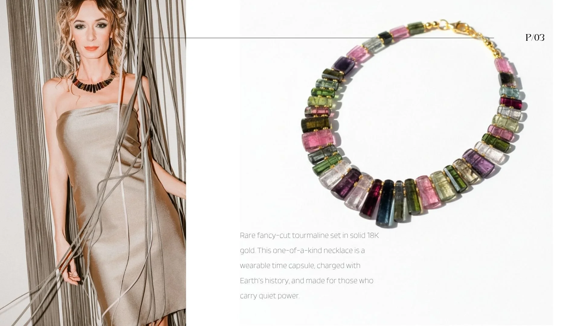
Chrome tourmaline. Tourmaline colored by chromium and vanadium into a green so saturated it reads almost electric. A 7 to 7.5 on the Mohs scale, tough enough for daily wear, and one of the few greens that holds its intensity under low light.
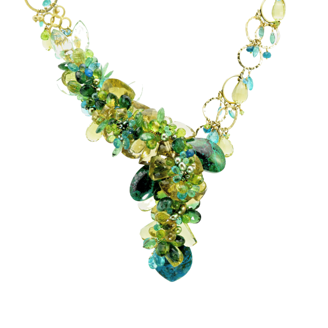
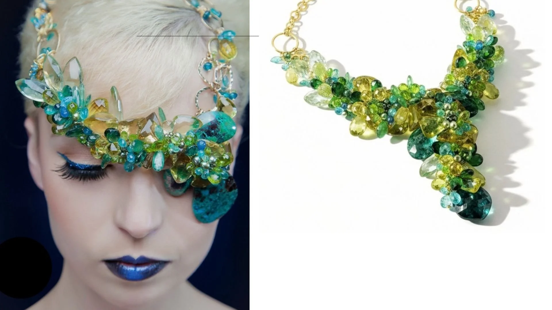
Chrysocolla. A copper silicate in teal and turquoise, usually shot through with dark copper matrix veining. Its hardness depends entirely on how much silica it absorbed as it formed, which is why the published range runs all the way from 2 to 7 on the Mohs scale. The translucent, glassy end of that range is called gem silica and approaches 7. The material I use is the opaque kind with visible matrix, which sits lower, so I put it in pieces built for an occasion rather than for every day.
Green amethyst, also called prasiolite. A soft leafy quartz at 7 on the Mohs scale. It sits at the quiet edge of this collection and is the one stone that belongs to both palettes, which makes it the bridge between this page and the pastel collection.
The reds and oranges
Spessartite garnet. Garnet is not one stone but a family, and spessartite is the manganese aluminum member, which is where that mandarin orange comes from. A 6.5 to 7.5 on the Mohs scale, with a brightness that survives being set next to much louder stones.
Rhodolite garnet. A natural blend sitting between pyrope and almandine, which gives it that raspberry purple-red rather than the brick red people expect from garnet. A 7 to 7.5, clear and bright, and it reads warm against both gold and silver.
Spinel. A magnesium aluminum oxide and, at 8 on the Mohs scale, one of the hardest stones in this collection. Spinel spent centuries being mistaken for ruby in royal collections before anyone understood it was a separate mineral. It is singly refractive, which is part of why it reads so clean and bright.
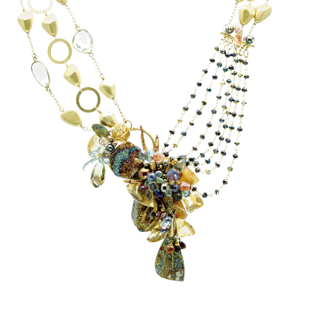
Fire agate. A chalcedony with microscopically thin layers of iron oxide inside it, which throw an iridescent flash of orange, red and green as the stone moves. A 6.5 to 7. The flash is structural, not a coating, so it is part of the stone and cannot wear off.
Citrine. Quartz in warm golden amber, a 7 on the Mohs scale, durable and easy to wear. Most commercial citrine is heat-treated amethyst rather than natural citrine, and mine most likely is too. If you want to tell them apart: natural citrine runs pale lemon to champagne with soft, even color, while the bright orange version with a whitish base and the color pooling toward one end has almost always been heated.
The purples and pinks
Deep amethyst. The same mineral as the pale lilac amethyst in my pastel work, quartz colored by iron, but at the saturated end of its range. A 7 on the Mohs scale. Where the stone lands on that range is a sorting decision I make at the bench, not something the mine decides for me.
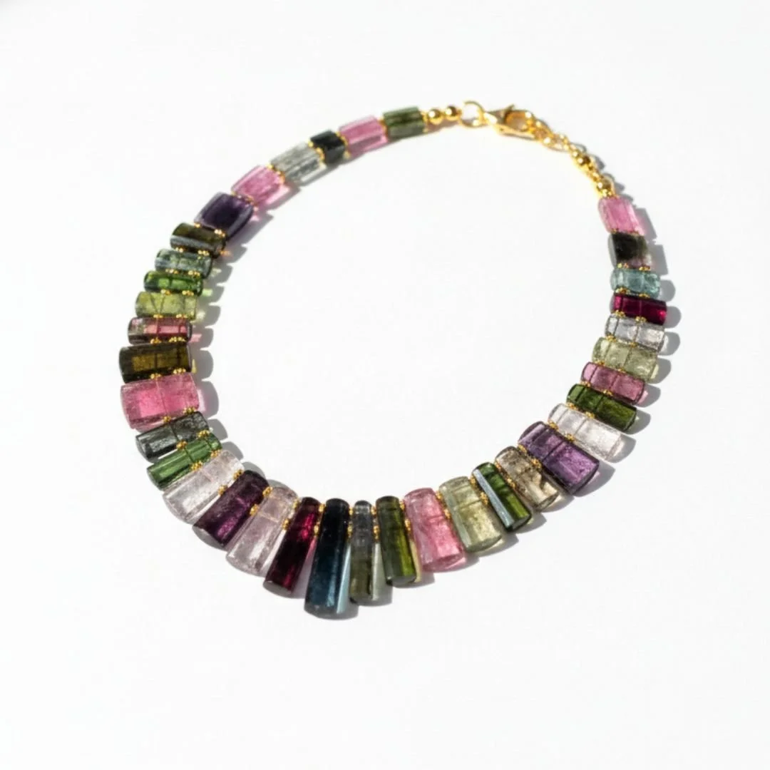
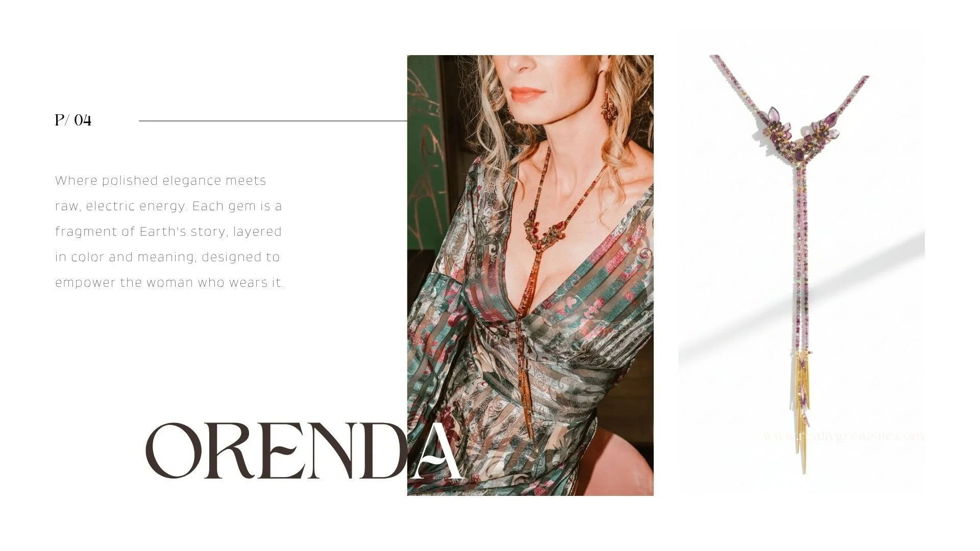
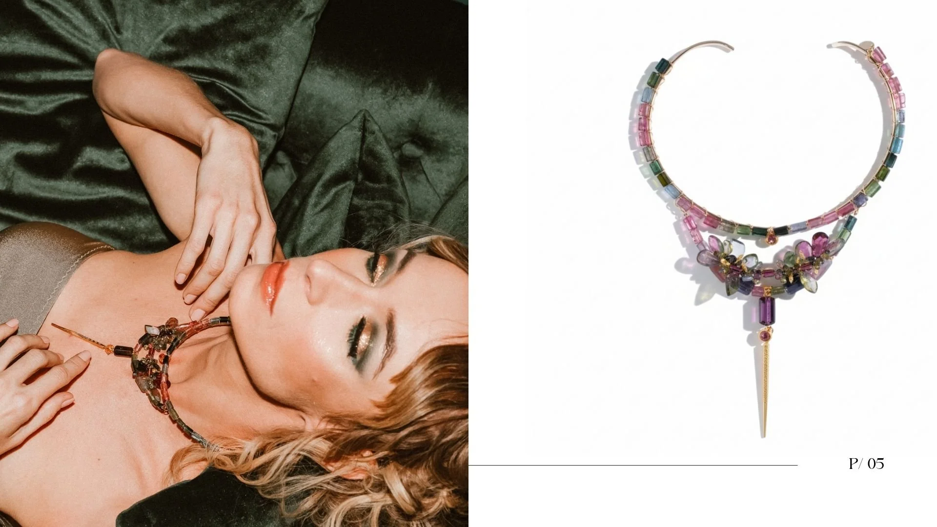
Watermelon tourmaline. A single crystal that grew pink at the core and green at the rim, sliced crosswise so you see both at once. A 7 to 7.5. The color zoning happened as the chemistry of the growing crystal changed, which means every slice is a cross section of its own history.
The darks and the fire
Black opal. Hydrated silica with a dark body tone, which is exactly why its play of color reads so vividly. The spectral flashes come from light diffracting through microscopic silica spheres stacked inside the stone. A 5.5 to 6.5 on the Mohs scale, so it is among the softest things I set.
Boulder opal. Opal that formed in the cracks of ironstone and is cut with that host rock left in place, so the brown matrix becomes part of the design. A 5.5 to 6.5. No two are cuttable the same way, because the shape of the opal seam decides the shape of the stone.
Ethiopian opal. A honey-toned opal with rainbow play of color, at 5.5 to 6.5. It is hydrophane, meaning it absorbs water, and a soaked stone can go temporarily cloudy and clear again as it dries. That single property changes how it has to be cleaned and stored.
Peruvian opal. A common opal, which means it has no play of color at all, just a soft opaque blue-green. A 5.5 to 6.5. Some Peruvian opal carries dark dendritic inclusions that look like tiny ferns; the material I buy does not, so mine reads as clean, even color.
From the bench · Andrea Li
The call gets made when I buy, not at the bench. I build a collection around a main center stone and then bring in a chorus of complementary stones that coordinate with it. So the sorting happens at the collection level, before a single piece exists.
For the pastel collection I had soft blush kunzites, Australian opals, pale amethysts and lavender keshi pearls. That group begged for a softly feminine palette. It told me what it wanted to be. When the center stones are saturated instead, tourmaline, green chrysoprase, garnet, deep purple amethyst, the chorus has to answer them, so I coordinate with a vibrant palette rather than a gentle one.
Neither one is the soft option. Both are statements. They are built for different moods, because jewelry is how you show the world how you want to be seen, and the piece has to represent that accurately.
Pastel or jewel tone: which palette is yours?
Both palettes are statements. Pastel sits at light tone and low saturation, airy and serene. Jewel tone sits at medium to dark tone with high saturation, dense and glowing. Pick your skin tone and the stones you are drawn to, and this will tell you which end of the range you lean toward.
1. Your skin tone
Pick the closest match.
2. The stones you are drawn to
Choose up to three. Go on instinct.
Selected 0 of 3
You lean pastel
Soft, luminous color suits you. You are drawn to stones that glow quietly rather than announce themselves, and light tone with low saturation is where your eye keeps landing.
Start with the pastel collection
Kunzite, morganite, aquamarine, moonstone and lavender keshi pearls, all hand-set one piece at a time.
See pastel gemstone jewelryThen see the other end
Plenty of people who lean pastel still want one saturated piece for evening. It is worth knowing what that looks like.
See jewel tone gemstone jewelryYou lean jewel tone
Saturated color is your register. You are drawn to depth and density, the stones that hold their own against black and carry a whole outfit on their own.
Start with the jewel tone collection
Chrysoprase, Colombian emerald, chrome tourmaline, spessartite and rhodolite garnet, spinel and deep amethyst.
See jewel tone gemstone jewelryCommission your own palette
Collections here are built around a center stone and a coordinating chorus. Yours can be too.
Start a custom projectYou sit right in the middle
You can wear both, and you probably already do. What decides it for you is the occasion rather than the palette, which means the question is not which one but which one today.
The saturated end
Medium to dark tone, high saturation, dense and glowing.
See jewel tone gemstone jewelryFrom the bench · Andrea Li
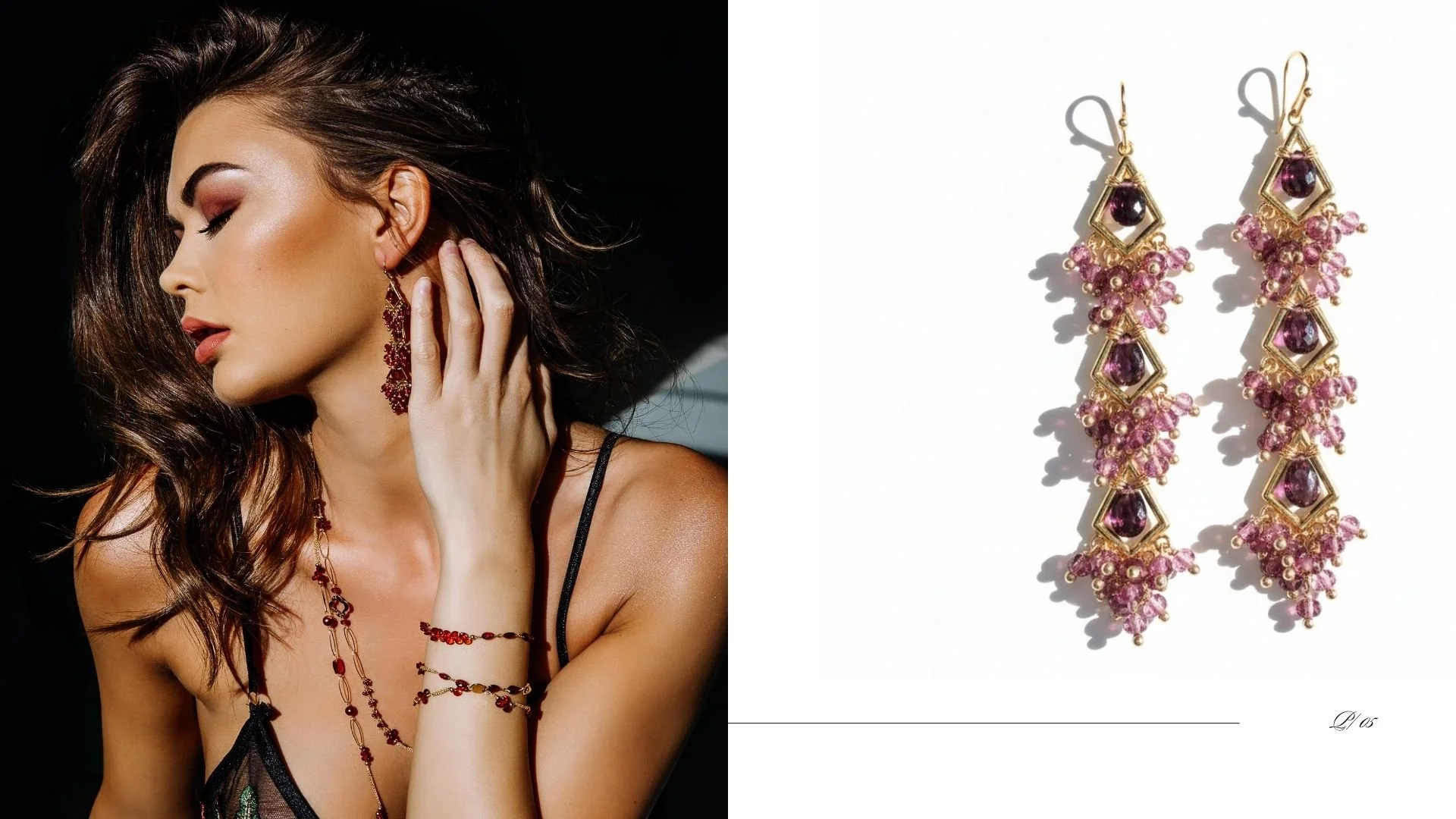
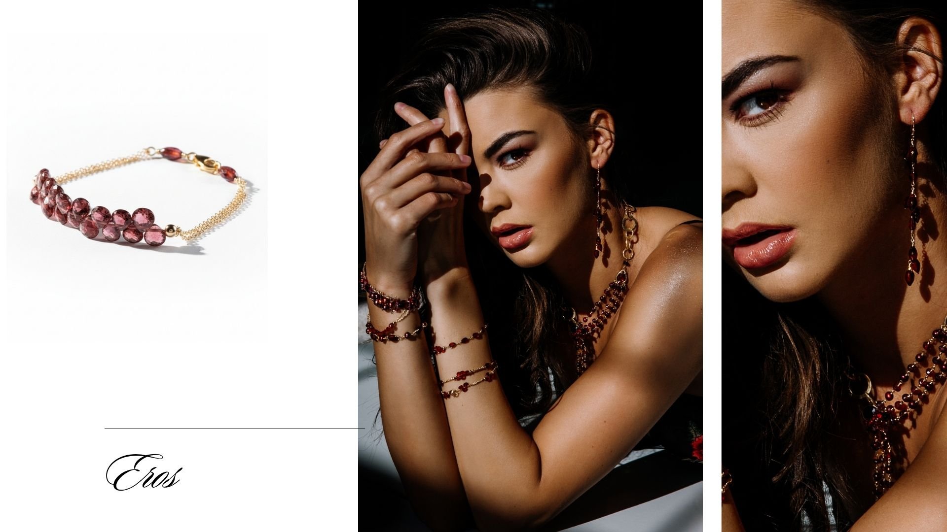
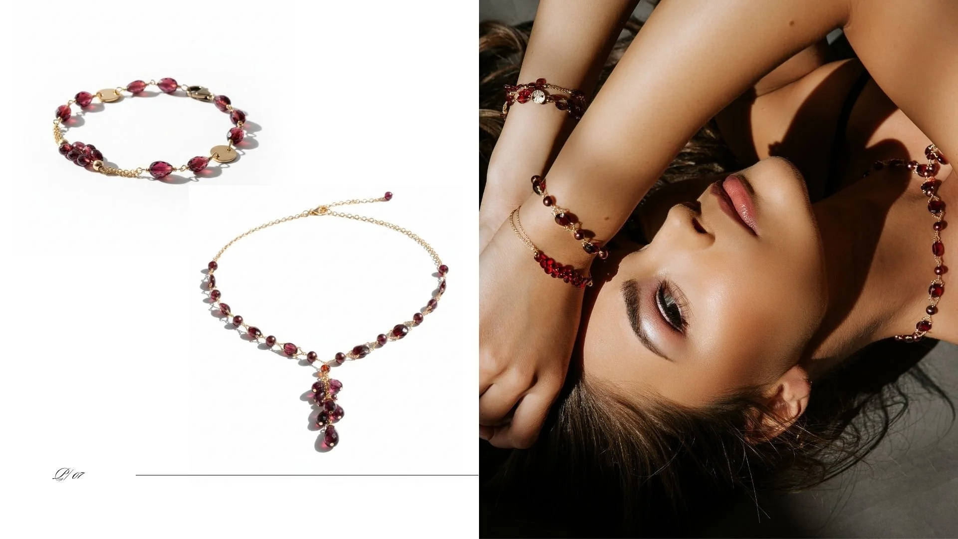
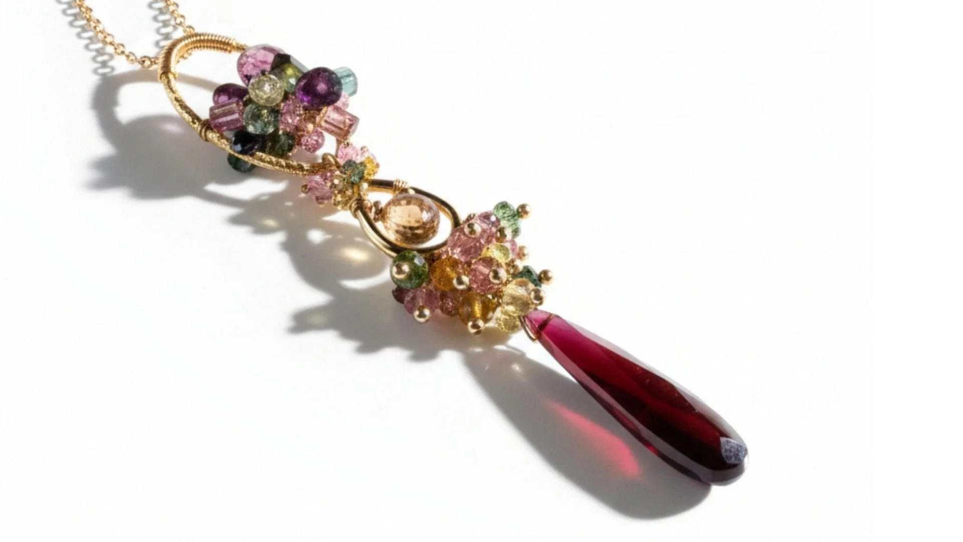
I buy stones for their beauty and their cut. A strand has to be stunning on its own, lying on the table, before it is ever part of one of my designs. That is the whole test. If a stone is already extraordinary before I touch it, whatever I build around it will magnify what is already there, and the finished piece becomes wearable art rather than a design with a stone in it.
Which means a lab report is not what I am shopping for. Heat treatment is standard practice across the trade and the gem house I buy from uses it, so a good share of what comes home with me has been heated. It does not change what made me pick it up.
From the bench · Andrea Li
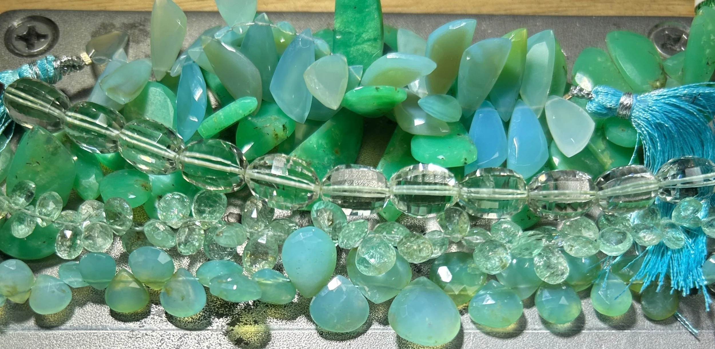
I found a strand of chrysoprase at the Tucson Gem Show. Deep apple green, almost glowing. If you have never been, it is the largest gem and mineral show in the world, and for a bench jeweler it is like being turned loose in a library where every book is one of a kind. You walk the aisles knowing that if you do not pick something up today, it will be gone tomorrow, and somebody else will take it home, and you will spend the next year thinking about the one that got away.
I picked up Colombian emeralds and Peruvian opals on that same trip. All green. All chosen because of Judy. She is one of my collectors, and she and I have built multiple collections together over the years. She told me once that she loved green chrysoprase specifically, and that comment lived in the back of my mind as I walked the aisles. When I saw these stones I heard her voice and could not put them down.
Those stones have been waiting ever since. That is the part of this work most people never see. Some stones come home and go straight to the bench. Others sit in a drawer for months or years, waiting for the right design to find them. I do not rush that. The stone tells me when it is ready.
Looking for the soft end of the range instead? See the pastel gemstone collection.
Which jewel tone stones hold up to everyday wear?
Hardness is measured on the Mohs scale, which runs from 1 to 10. Anything at 7 or above wears comfortably day to day. Below 6.5, a stone wants a little thought about where you wear it.
ChrysopraseApple green6.5 to 7Vivid, aliveColombian emeraldDeep blue-green7.5 to 8RegalChrome tourmalineSaturated green7 to 7.5Electric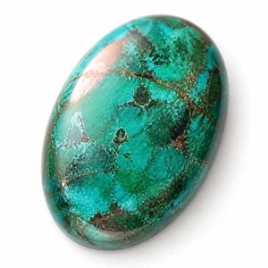 ChrysocollaTeal and copper2 to 6Oceanic
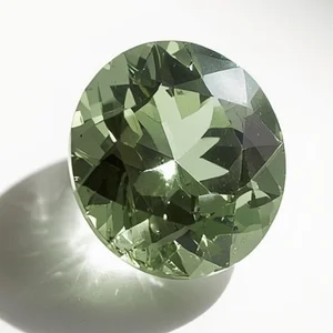 Green amethystSoft green7Fresh, coolSpessartite garnetMandarin orange6.5 to 7.5BlazingRhodolite garnetRaspberry red7 to 7.5Warm, deepSpinelHot pink-red8Brilliant
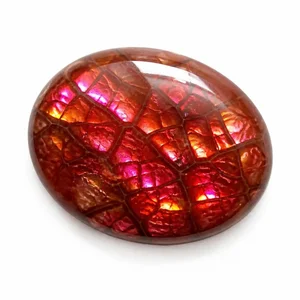 Fire agateIridescent red-brown6.5 to 7Smoldering
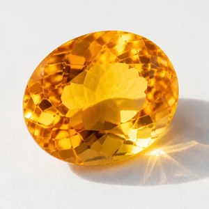 CitrineGolden amber7SunlitDeep amethystRoyal purple7Rich, regal
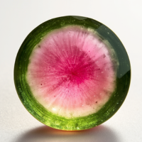 Watermelon tourmalinePink and green7 to 7.5Playful
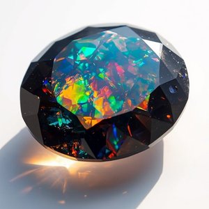 Black opalDark with spectral fire5.5 to 6.5Dramatic
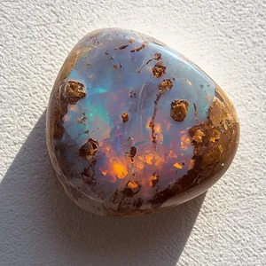 Boulder opalIronstone and color5.5 to 6.5Earthy, wildEthiopian opalHoney with rainbow fire5.5 to 6.5Luminous
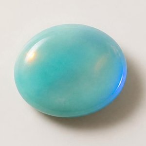 Peruvian opalSoft blue-green5.5 to 6.5Calm
The softest stones here are the opals, which is why I set them where they take the least knocks. Looking for the other end of the range? See the pastel gemstone collection.
Keep reading
Every stone on this page has a guide behind it, and most have a collection of their own.
Gemstone guides
ChrysopraseWhy the green comes from nickel, and what to look for in a cabochon.
TourmalineFrom chrome green to watermelon, the most varied stone I set.
GarnetNot one stone but a family. Spessartite, rhodolite and the rest.
AmethystThe same mineral at both ends of the saturation range.
OpalFire, water, and the most delicate stone I set.
Related collections
These pieces have a companion at the soft end of the spectrum. See the pastel gemstone collection.
Questions I get about jewel tone jewelry
What if a jewel tone piece I like is sold out, can you recreate something similar?
Yes. Since my pieces are one-of-a-kind and hand sculpted, I can create something similar but not exact. The gemstones I select are chosen for their rarity and unique cuts, with limited availability. I can usually find other gemstones comparable to those in the original design to recreate a piece infused with its own story of originality.
This comes up more with jewel tones than with pastels, because a saturated stone in an unusual cut is harder to match twice. I would rather tell you that up front than promise a copy I cannot make.
How does a custom jewel tone commission work?
It starts with a conversation about which pieces or styles you are drawn to. I source gemstones specifically for your piece where I can, build a private page for larger orders so you can see everything in one place, and work at a pace that puts craftsmanship ahead of speed.
Commissions run from a single piece to multi-batch collections built over months or years. One collector has commissioned more than twenty pieces with me across three batches. Start a custom project.
How do I care for the softer jewel tone stones?
Most jewel tone stones are hard enough to wear without thinking about it. Spinel sits at 8 on the Mohs scale, emerald at 7.5 to 8, garnet and tourmaline at 7 or above. Those are everyday stones.
The ones that want a little thought are the opals and the chrysocolla. Opals sit at 5.5 to 6.5 and Ethiopian opal is hydrophane, meaning it absorbs water, so it should never be soaked and can look temporarily cloudy if it gets wet. The chrysocolla I use is the opaque kind with visible matrix, which is softer still, so I build it into pieces made for an occasion rather than for every day.
For everything: put jewelry on last, after perfume and lotion, and take it off before washing, exercise and sleep. Store each piece separately so a harder stone cannot scratch a softer one.
Do you make matching earrings for a necklace?
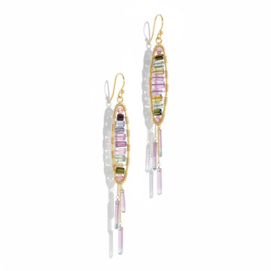
Yes, and it is one of the most common things people ask me for. My work does not sit comfortably next to standard jewelry, so a companion pair solves a real problem rather than just matching.
I usually keep the earrings as a post or a stud. The necklace should be the thing people see first, and a second statement piece competing with it does neither of them any favors.
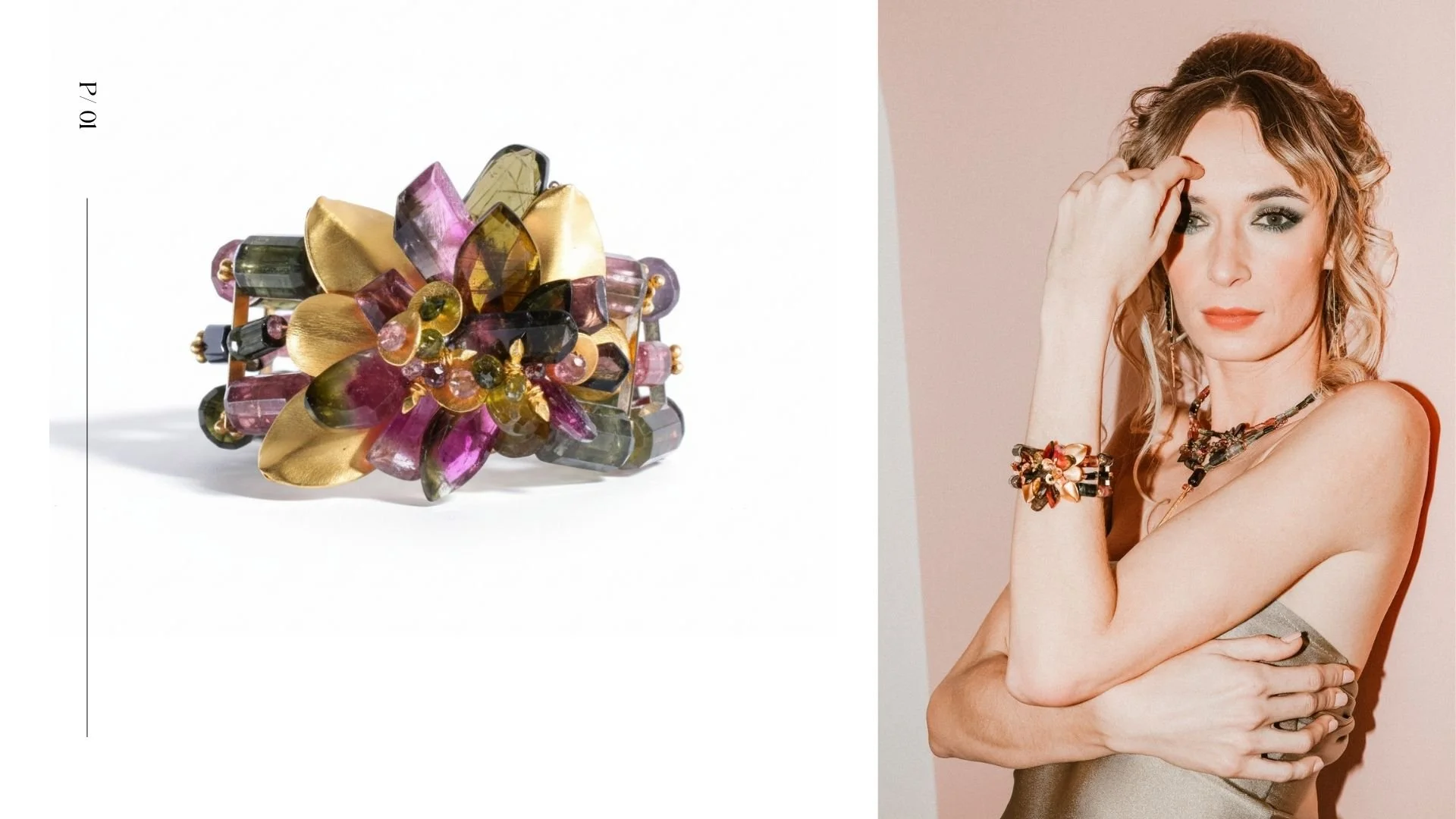
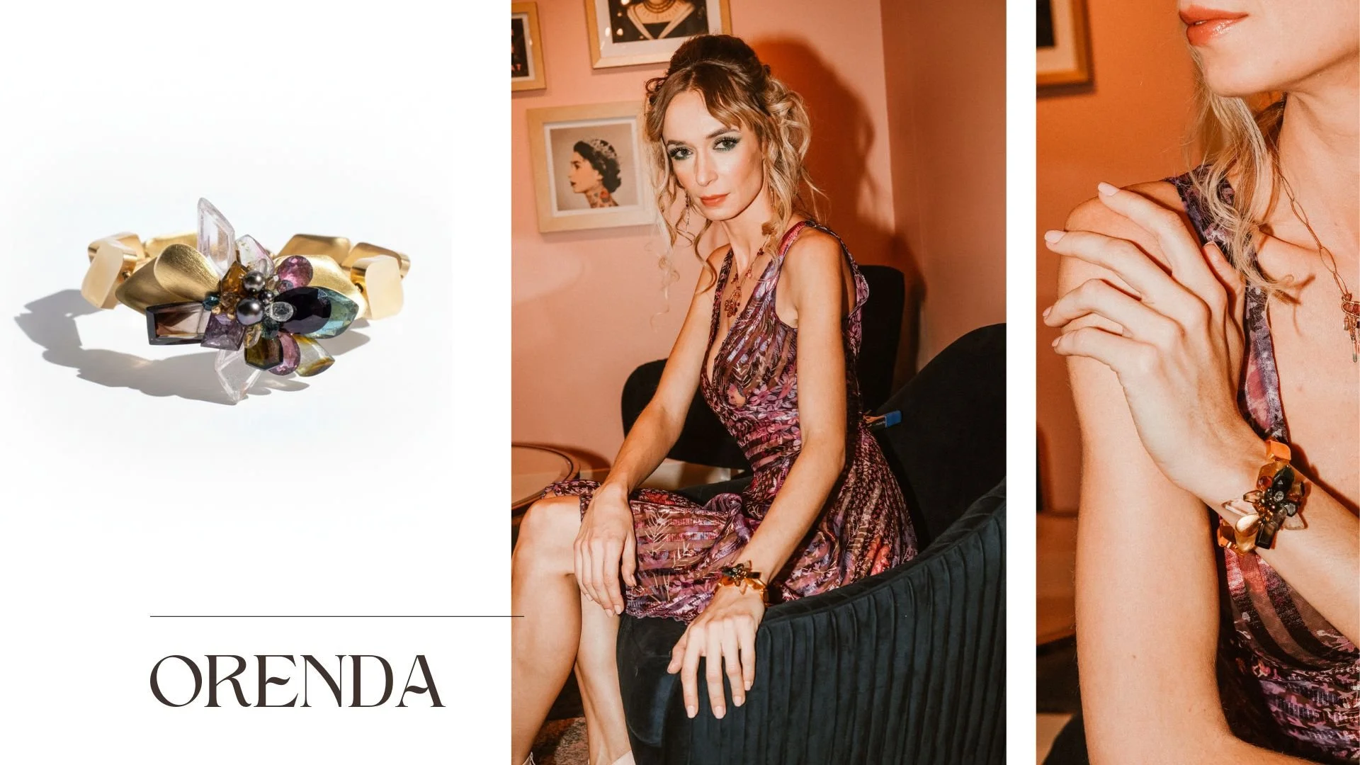
From the Signature Collection. A line born from pure artistic expression. Unbounded by rules or limitations of mass market appeal. These are meant for serious collectors. They are never to be replicated or manufactured. These works of art stand alone as originals. They are as authentic as their potential owners. These masterpieces require hours of intensive labor and thoughtful design. Each with a story unique to its development.
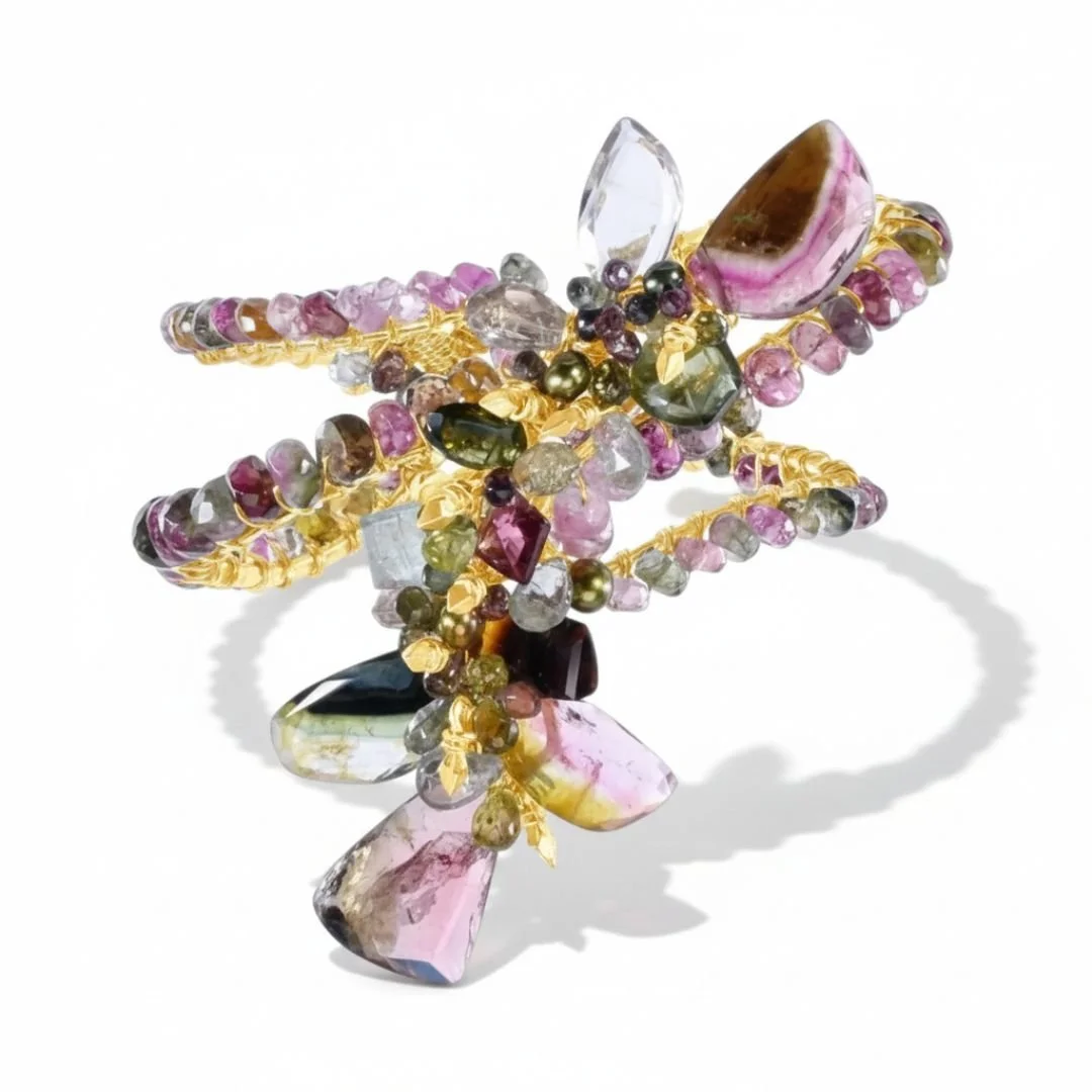
Let your jewelry do the talking with this magnificent piece of wearable art. Featuring a chrysocolla centerpiece. This stone is often seen as a protective and healing stone. Its lush green color is reminiscent of an emerald forest. A chorus of apatite, peridot, topaz, and chalcedony are woven together, creating a candy-like cacophony of colorful gemstones that wrap around your wrist. With 24k gold vermeil and 14k gold-filled finishes.